
Rethinking How We Visualize Data
- By: Brittany Bickford, MPH
- Date
 As evaluators, it often seems our work life is entrenched in data—from determining what data we want to collect, how we want to collect it and from whom, and how to make sense of it when we have it. We are in a constant cycle of asking, synthesizing, cleaning and analyzing until we feel confident that if we spend one more minute pouring over the data our eyes will assuredly cross forever.
After we’ve done due diligence to the data collection and analysis process, there’s a critical next step: how can we most effectively share our shiny findings?
Over the past several years, NNPHI has become increasingly invested in improving our approaches to data visualization. Partly motivated by several inspired sessions with Stephanie Evergreen at the American Evaluation Association Conference, and partly guided by the interest of our members and funders, we have been engaged in an informal data visualization quality improvement process.
In doing so we’ve realized that many of our standbys—say, default Excel graph formatting coupled with wordy Power Point presentation slides—were simply not working.
Yet they’re still ubiquitous. Why?
Communicating our findings with maximum impact
Evergreen summarizes the conundrum well in her book, Presenting Data Effectively: Communicating Your Findings for Maximum Impact:
“Many of us who come up through an academic pipeline have been drilled with our department’s required style manuals, which seemed to point towards pages and pages of prose, or the painful construction and formatting of graphs and figures. In turn, some of us found our way to government positions where PowerPoint templates and colors were mandated, and clearance departments had a final say in the look of all reports.”
In other words, we’ve carried the data visualization lessons we learned in graduate school into our professional lives. Those approaches are then further validated by requirements within our organizations and funders. Thus, the cycle continues.
Fortunately, the field is changing. There are more and more conference sessions, articles, and webinars encouraging folks to rethink the way they’re presenting data. And, as it turns out, it doesn’t have to be a painful process.
Below we’ll share some high level data visualization recommendations that’ll hopefully help reframe the way you think about sharing data.
And don’t worry: we’ll also share some resources that’ll help you get down to the nitty gritty.
1) Establish how the data will be used.
It’s important to know how the data will be used, and by whom. For example, will your data be used exclusively by folks with a deep knowledge of the subject matter, or will be it be part of a tool meant for a broad audience?
It may be also be helpful to engage your users/stakeholders in the early phase. By engaging the users, you may be able to identify early wins [link to: http://www.information-management.com/gallery/data-visualization-best-practice-design-analytics-dashboard-10022839-1.html] as they can provide insight you may not have considered. Also, you are more likely to land on a deliverable that makes everyone happy.
2) Simplify.
To demonstrate this recommendation, we’ll rely on the example below.
Figure 1 was created using default Excel settings with little adjustments (and fictitious data):
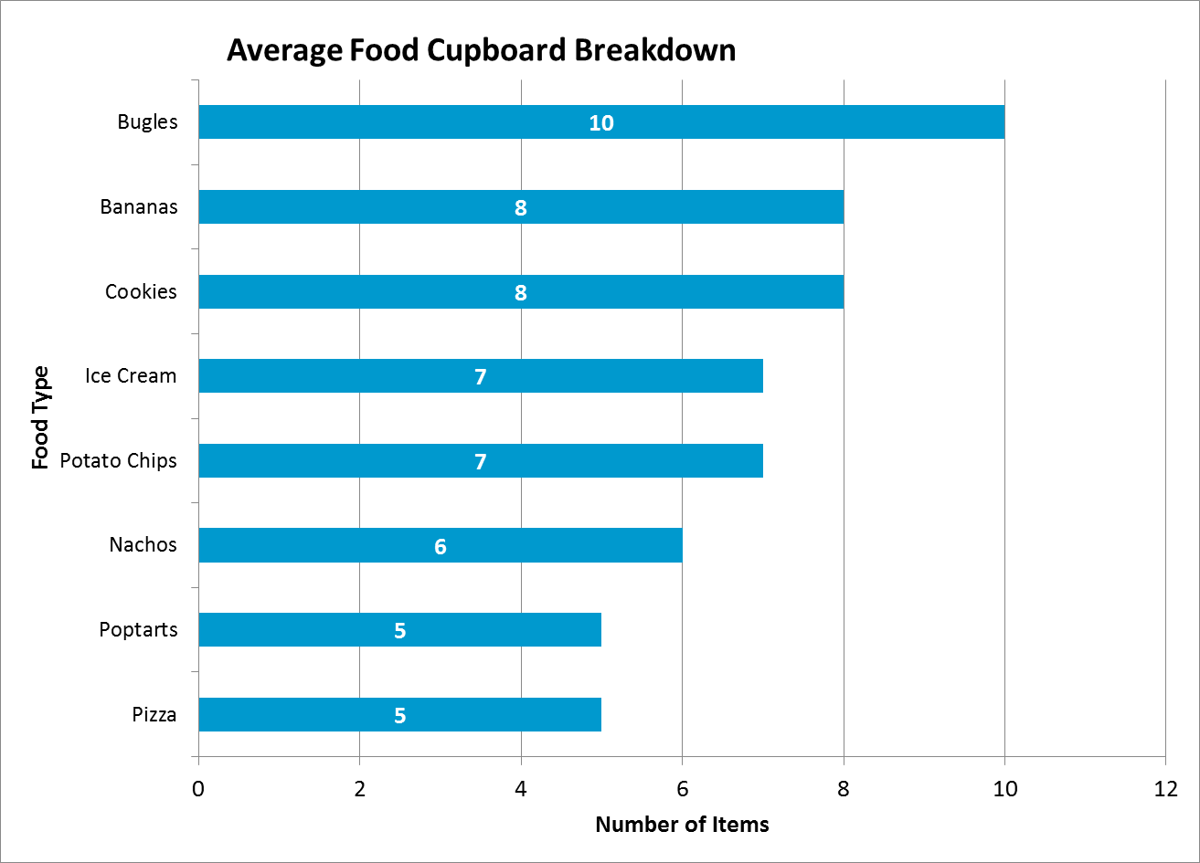
Figure 1
Your first thought might be, “This looks fine?” But see the Figure 2 below:

Figure 2
Okay, we’re not saying the graph above is a masterpiece but it’s an improvement, right?
What did we do? Not that much.
We a) removed extraneous labels and grid marks and b) chose a title that both calls out a key finding and defines the information presented in the graph. It has less stuff but tells the same story.
And it looks better. And it was easy!
And this brings us to our next recommendation:
3) Ensure you are using the most appropriate figure.
It’s imperative that you choose which graph or chart you are using wisely because, “When you choose how to visualize your data, you’re deciding what type of relationship you want to emphasize.
For example, look at this pie graph (Figure 3):
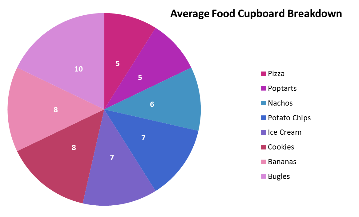
Figure 3
It might look okay but…what does it mean? We can see that there are a variety of foods in the cupboard but it’s hard to really compare, and the information doesn’t seem particularly meaningful. You’re left confused and frustrated and certainly will not retain any of the information.
Evergreen and other data visualization experts indicate that pie graphs should be used to demonstrate parts of a whole. In this case, we’re not necessarily interested in demonstrating the cupboard as a whole—rather, we’d like to emphasize the difference between the different types of food. Hence, the bar graph in Figure 2 is a more appropriate way to visualize these data in a way and actually drive our point home.
4) Apply basic Design Principles.
When in doubt, allow other disciplines to weigh in. The following visual design principles can also be applied to data visualization:
a. Displays of related information are horizontally and vertically aligned so the eye can see patterns across related variables (they do not have unintended alignments that suggest misleading or irrelevant comparisons).
b. Color serves to highlight exceptions, not to enliven a dull dashboard.
Time for another example. In Figure 4, we’ve decided to take the half glass full approach and used color to highlight the one healthy food cupboard item:
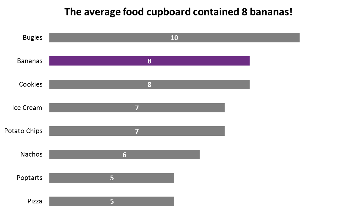
Figure 4
c. Analytic results are not presented to 10 decimal places when the user does not need such precision to make a decision.
5) Lastly, use this checklist!
Look to the experts. Stephanie Evergreen, data visualization extraordinaire, pulled together this beautiful checklist and she says it better than we ever could.
Want more? Here are some additional resources:
Blogs:
data analysis + visualization by Ann K. Emery, Co-Chair of the American Evaluation Association’s Data Visualization and Reporting interest group, Secretary for the Washington Evaluators, member of the American Evaluation Association’s Professional Development Working Group, and past conference planner for the Eastern Evaluation Research Society.
EvergreenData by Stephanie Evergreen, PhD, editor of two volumes of New Directions in Evaluation on Data Visualization, and author of Presenting Data Effectively.
Short Articles:
“The Quick and Dirty on Data Visualization” by Nancy Duarte at the Harvard Business Review
7 Tips for Effective Data Visualization from Deloitte analytics and visualization expert Dave Steier.
Books:
Presenting Data Effectively, Communicating Your Findings for Maximum Impact (Stephanie D.H. Evergreen): Available Here.
Author:
 Subscribe To Our Communications